No edit summary |
No edit summary |
||
| (One intermediate revision by the same user not shown) | |||
| Line 12: | Line 12: | ||
[[File:Screen Shot 2022-09-16 at 4.23.18 PM.png|center|thumb|635x635px|Screen Editor]] | [[File:Screen Shot 2022-09-16 at 4.23.18 PM.png|center|thumb|635x635px|Screen Editor]] | ||
== | == Screen Details == | ||
Screen details vary based on screen type selected. The following screen details pertain to all screen types | Screen details vary based on screen type selected. The following screen details pertain to all screen types | ||
| Line 20: | Line 20: | ||
The following sections describe the screen details available to specific screen types and include example screens. | The following sections describe the screen details available to specific screen types and include example screens. | ||
=== | === Message === | ||
The following settings are specific to Message screen types: | The following settings are specific to Message screen types: | ||
| Line 29: | Line 29: | ||
[[File:Screen Shot 2022-09-16 at 4.25.29 PM.png|center|thumb|827x827px|Message Screen Details (left) vs Example Screen (right)]] | [[File:Screen Shot 2022-09-16 at 4.25.29 PM.png|center|thumb|827x827px|Message Screen Details (left) vs Example Screen (right)]] | ||
=== | === Screen === | ||
The following settings are specific to Screen screen types: | The following settings are specific to Screen screen types: | ||
| Line 37: | Line 37: | ||
[[File:Screen Shot 2022-09-16 at 4.26.34 PM.png|center|thumb|827x827px|Screen Screen Details (left) vs Example Screen (right)]] | [[File:Screen Shot 2022-09-16 at 4.26.34 PM.png|center|thumb|827x827px|Screen Screen Details (left) vs Example Screen (right)]] | ||
=== | === Prompt === | ||
The following settings are specific to Prompt screen types: | The following settings are specific to Prompt screen types: | ||
| Line 47: | Line 47: | ||
[[File:Screen Shot 2022-09-16 at 4.27.38 PM.png|center|thumb|827x827px|Prompt Screen Details (left) vs Example Screen (right)]] | [[File:Screen Shot 2022-09-16 at 4.27.38 PM.png|center|thumb|827x827px|Prompt Screen Details (left) vs Example Screen (right)]] | ||
=== | === Item Select === | ||
Item Select The following settings are specific to Item Select screen types: | Item Select The following settings are specific to Item Select screen types: | ||
| Line 55: | Line 55: | ||
[[File:Screen Shot 2022-09-16 at 4.28.35 PM.png|center|thumb|784x784px|Item Select Screen Details (left) vs Example Screen w/ Large Item Mode(right)]] | [[File:Screen Shot 2022-09-16 at 4.28.35 PM.png|center|thumb|784x784px|Item Select Screen Details (left) vs Example Screen w/ Large Item Mode(right)]] | ||
== | == UI Components for Custom Component Screens == | ||
The following UI components are available for custom component screens: | The following UI components are available for custom component screens: | ||
Latest revision as of 16:17, 7 August 2024
Back to MiConnect Categories Page
Screens are customizable windows that overlay the main interface when they are called up from a routine. The following screen types are available by default in tool connect:
- Custom component: Fully customizable screen that allows various UI components to be organized in a customized layout. This grants the user full control over the purpose and content of the screen. UI components include labels, textboxes, images, check-boxes, and comboboxes (drop down menus)
- Message: Default screen that displays a user defined message. Pre-configured message formats are available.
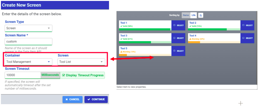
- Screen: Displays a custom screen provided by system components and plugins (e.g. displays the tool list and tool life data in a predesigned layout.)
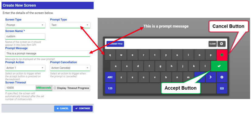
- Prompt: Default screen that displays a custom message that prompts the user to input information using an onscreen keyboard.
- Item Select: Prompts the user to select from a list of actions to take
Screen Details
Screen details vary based on screen type selected. The following screen details pertain to all screen types
- Name: This is the name of the screen as it is displayed in Tool Connect.
- Screen Timeout: When a timeout is specified, the screen will automatically timeout after the set time. Mark the Display Timeout checkbox to display a timer on the screen to keep track of the timeout.
The following sections describe the screen details available to specific screen types and include example screens.
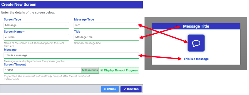
Message
The following settings are specific to Message screen types:
- Message Type: Determines the icon displayed on the message box
- Title: An optional title that is displayed in the header of the message box
- Message: The desired message to be displayed in the message box
Screen
The following settings are specific to Screen screen types:
- Container: Selects the system component or plugin that provides the desired custom screen
- Screen: Selects the desired screen from the specified system component or plugin
Prompt
The following settings are specific to Prompt screen types:
- Prompt Type: Determines the format of the onscreen keyboard for user input (Text or Numeric)
- Prompt Message: This is the message displayed above onscreen keyboard
- Prompt Action: This determines which preconfigured action is taken when the Accept button is pressed on the onscreen keyboard
- Prompt Cancellation: This determines which preconfigured action is taken when the Cancel button is pressed on the onscreen keyboard
Item Select
Item Select The following settings are specific to Item Select screen types:
- Title: An optional title that is displayed in the header of the message box
- Message: The message displayed above the option items
UI Components for Custom Component Screens
The following UI components are available for custom component screens:
- Label: Displays a box with a custom label. Label box size and position is also customizable.
- Textbox: Adds an empty textbox for user input
- Image: Displays an image that exists in the system l Checkbox: Adds a checkbox for selecting options on the displayed screen
- Combobox: Adds a dropdown menu that can be populated with options
- Stack: A layout component that allows multiple UI components to be contained and organized into a vertical or horizontal stack
- Data Grid: A layout component that provides a customizable grid for UI components. The data grid layout has a header row, a number of columns and customizable column width. Individual UI components can be added to columns underneath the header row.


